Description
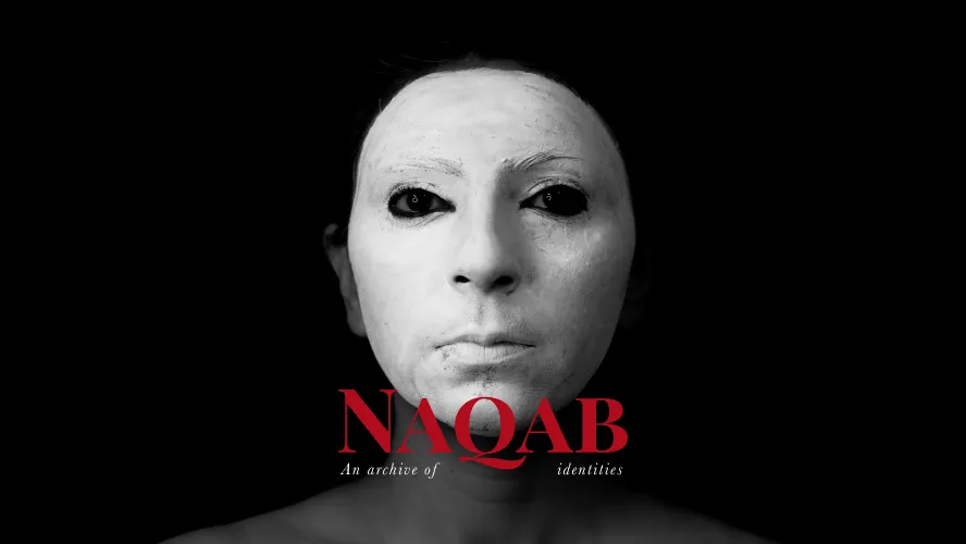
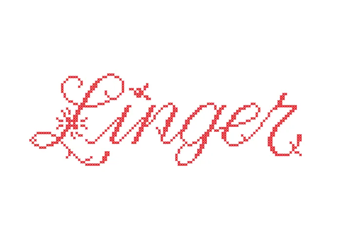
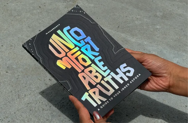
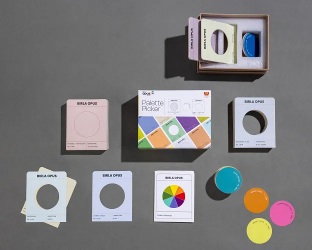
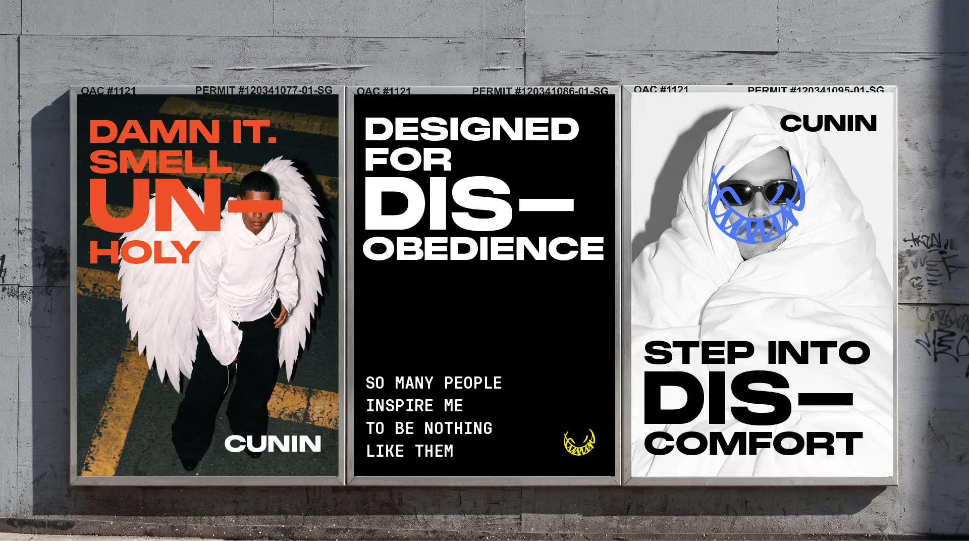
In the English language, there are words. And then there are antonyms to those words. Which, for reasons nobody has bothered to explain, is usually just the same word with a small prefix glued to the front of it: UN- IM- IR- NON- MIS- It’s a bit like giving someone a personality by simply saying they’re not it. At CUNIN, we believed the antonyms deserved better. So, we gave them a spotlight of their own. Instead of hiding behind polite grammar, we pulled these prefixes to the front and let them hijack the conversation. Splitting a word in half creates a moment of tension between what you expect to read and what you actually get. That tension became the blueprint for everything we designed. It escaped the margins of the page to build an entire world- defining our visual language, voice, typography, social media layouts, motion systems, and packaging. The writing doesn’t ask for permission- it sets the rules.