Description
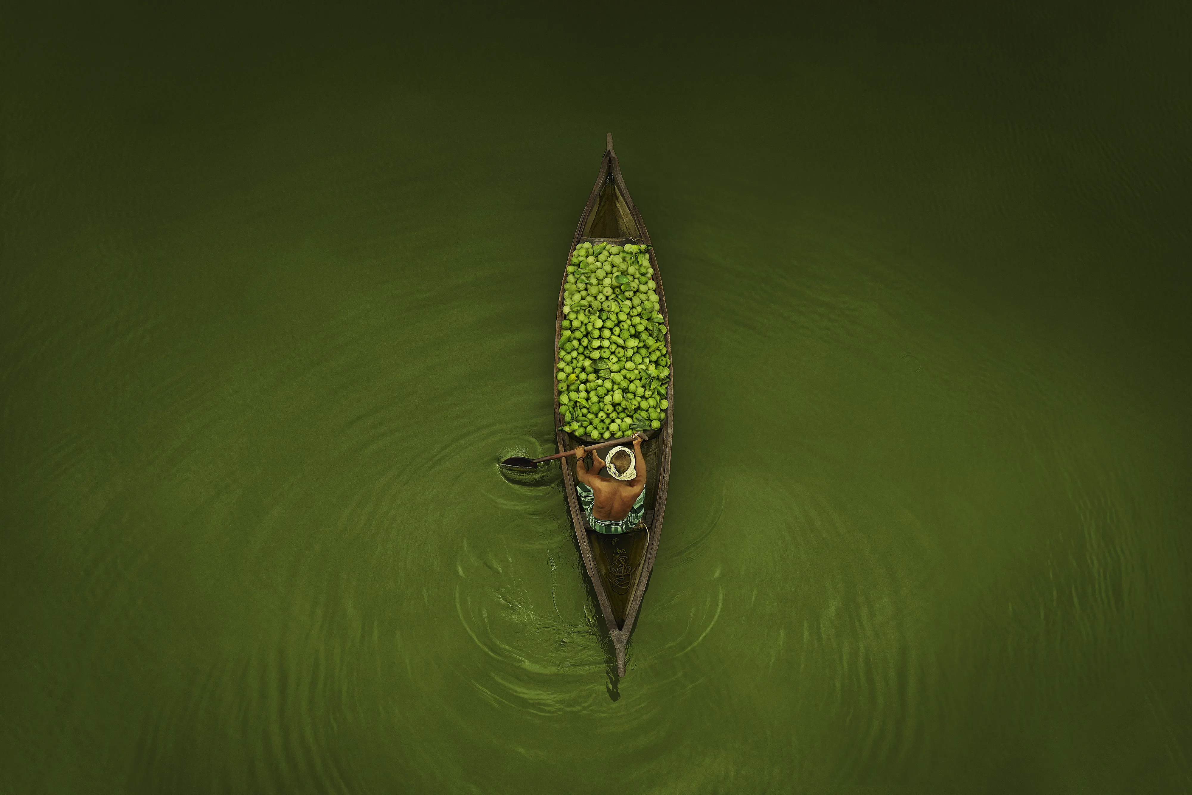
No studio lighting. No set designs. No manufactured moments. Just the right places, the right people & enough fruit to make you believe, even before a single word is read. The brief was simple in the most honest way. Before the scoop, there is a tree. Our job was to find that tree & everything that happens around it. Visually, the Idea was to either show abundance, the process or the people who are part of the process. Identifying the top angle was primarily to create a visual hook & add graphic nature to the campaign. It worked as an evidence, with a strong visual quality. The documentary instinct here was deliberate. Because the most persuasive thing a food brand can do is make you feel like you arrived somewhere that was already happening without you too. We identified the situation and choose the right color palette, as per the fruit or the situation. e.g. pink kurta to match the inside of watermelon, green lake with green guava to create a strong visual thats stays. Thanks