Description
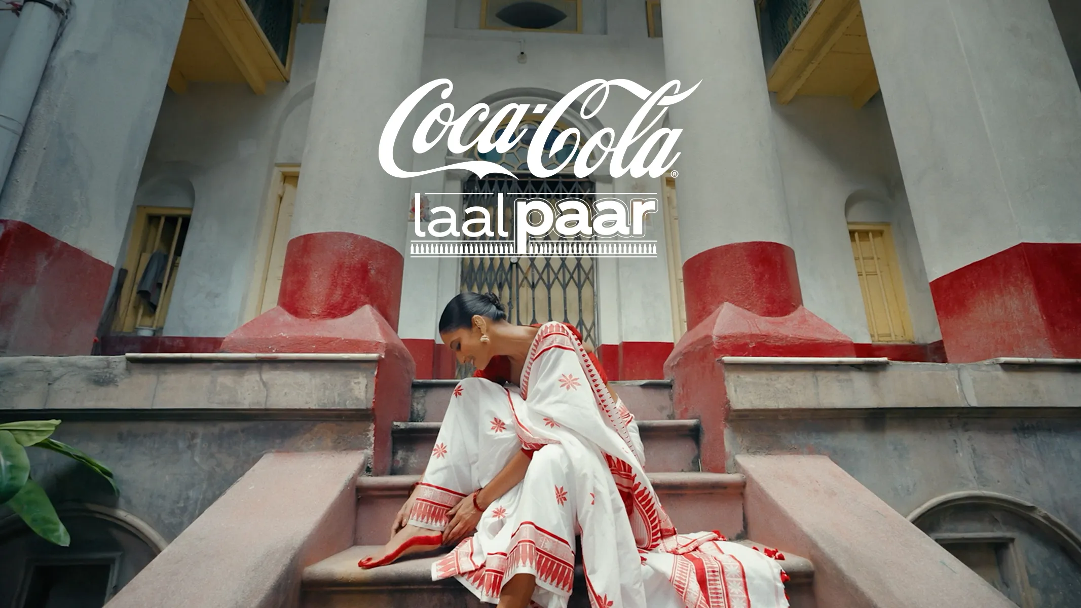
Our art direction transcended the visual to become tactile and alive. The core decision was to make the medium the message: a handloom saree, made from discarded Coke bottles, became our canvas. We art-directed a fabric, not a poster. The palette was a respectful adoption of Puja’s sacred red and white. The key visual was a subtle, block-printed motif blending the Coke bottle with local patterns. Our “models” were the community’s women, and our “gallery” was the sacred pandal. This art direction chose authenticity over advertising, creating a living aesthetic that was felt with pride, not just seen.