Description
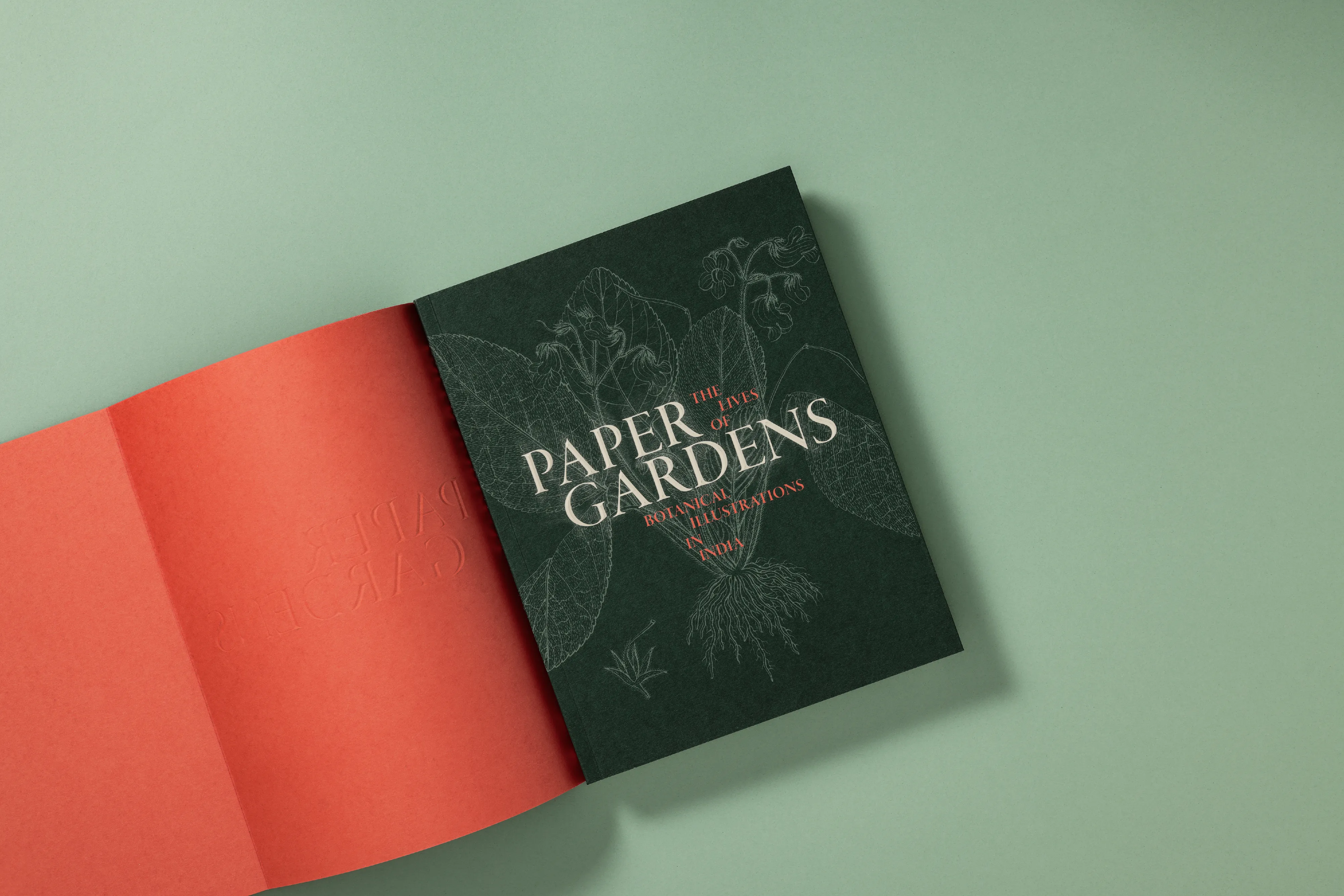
Brief • Design a book with commissioned essays & plates for an exhibit at MAP • Be inviting & readable, not a coffee table book • Faithfully reproduce original hand-painted lithos in a contemporary design Process • Studied archives, examining colour, structure & ageing of books • Research revealed a gap: hard-bound, glossy botanical books showcase imagery but lack experience Design • Scale balances images with comfortable reading • Soft cover adds intimacy; teal green echoes archival covers; fluorescent orange adds fresh delight • Cover book-ends varied colour fields within which amplify adjacent artworks • Fold-outs echo archival books; gateway sheets add layers–both allow magnified images that invite pause • Classic grid is disrupted by shifts & insets. Adobe Garamond Pro echoes historic letterforms, while sans-serif pull-outs bridge old & new • Semi-coated paper through multiple proofs reproduces colour without loss The archived is interpreted into a bold contemporary form