Description
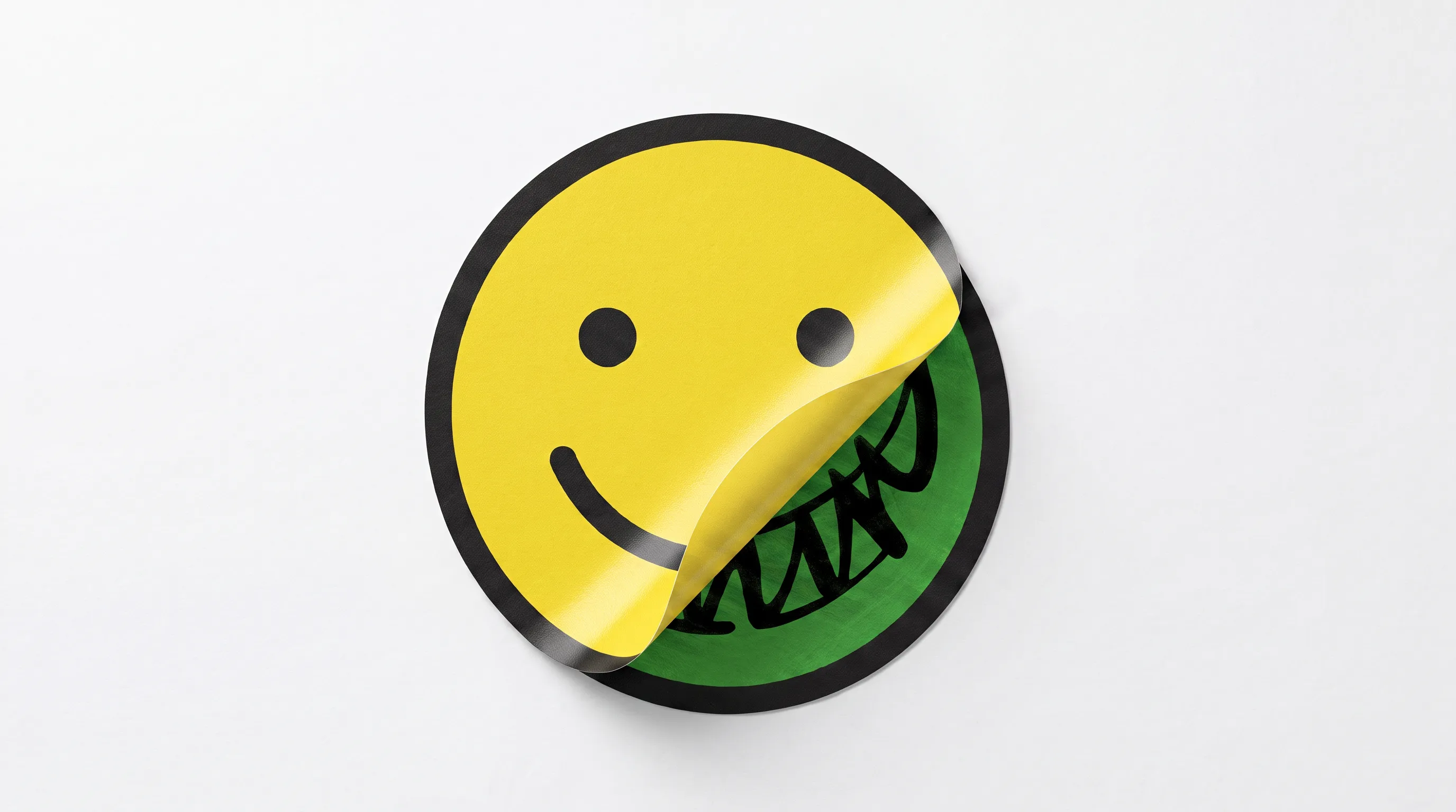
CUNIN was built for the misfits who wear their difference like a badge of pride. The visual language is anchored on the graphic tension of the antonym. By inserting a prefix and hyphen, everyday words are negated- creating friction between expectation and meaning. Typographic tension is created by pairing the heavy structure of PP Monument Extended with Fontless Mono, a customized cut of a monospaced typeface stripped of inktraps. Across direct-flash photography, the 'UN-Detected CUNIN Cam' documents unforced situations twisted with absurdity, preserving the messy, imperfect context of real-life spaces. Merchandise spans two fronts: a novel type-led apparel and an unconventional satirical product design interventions that act as CUNIN’s UN-Artistic statement. Across generative motion blocks and animations, the brand stays unapologetically raw.